Received yet another email
Another past participant recently wrote this:
I have done many models with covariates that fit the data and they give me very different results regarding abundance (ranging from 600 to 2000 animals). The model with best AIC gives me a very low Pa (0.085) and high abundance. Another model … improved Pa (0.349) and reduced abundance I don’t feel comfortable choosing a model because here my decision is very important.
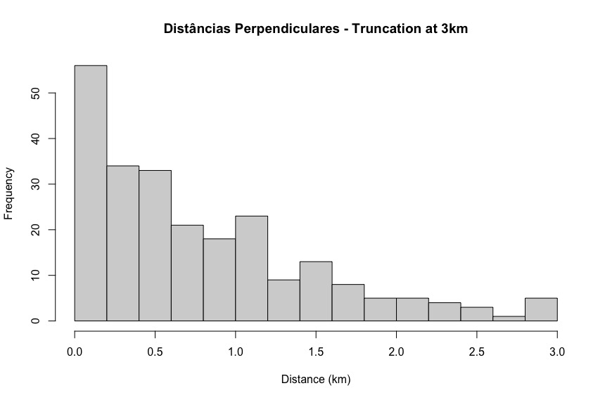
Asking for further details, this histogram of detection distances was revealed:
What is your diagnosis?
Further investigation
To see what happened next, click the arrow at the right of the box below:
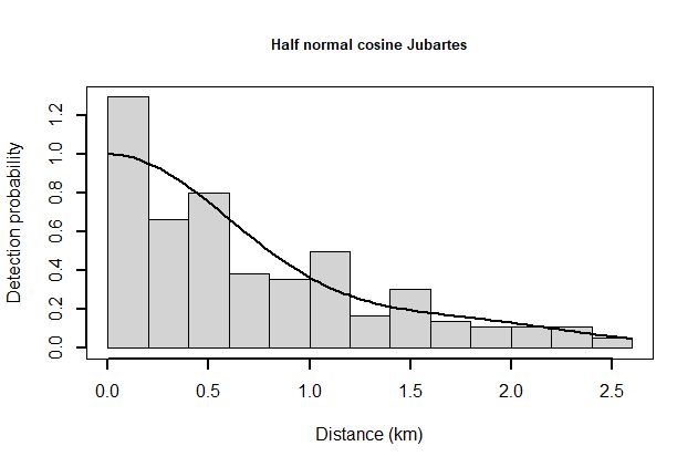
Model with the lowest AIC was the hazard rate, trying to fit the spike at small distances. The rapid decline of the fitted hazard rate model resulted in the very low estimate of detection probability. The alternative model described would be the half normal (shown below).
The issue isn’t so much which model is better, but rather whether the histogram of perpendicular distances is to be believed. What causes the number of detections to fall from ~55 at distances <200m, to ~35 at distances 100-200m.
The spike of detections at small distances is very difficult to fit; thinking hard about data collection protocol for the next survey is a reasonable course of action.